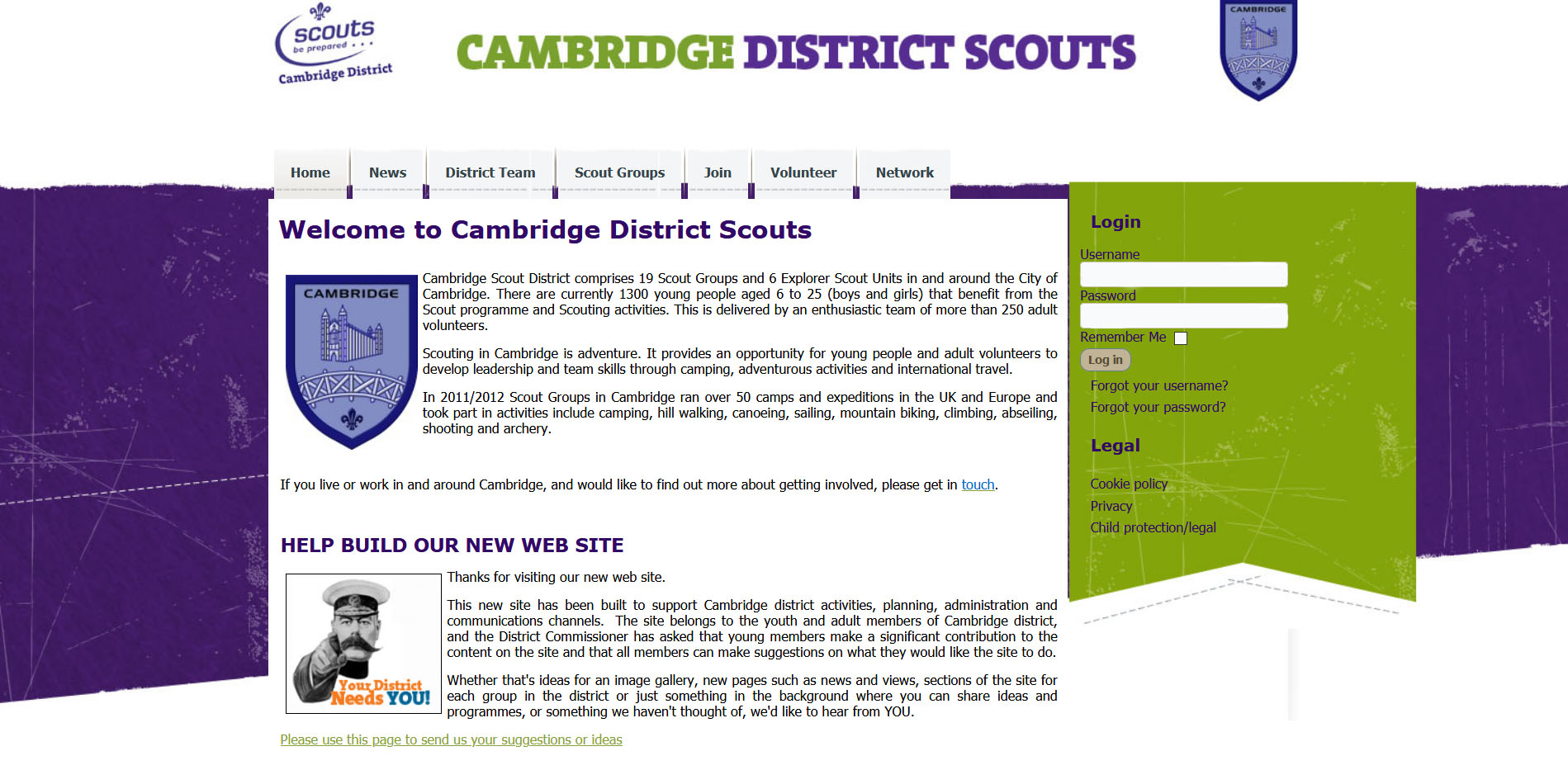
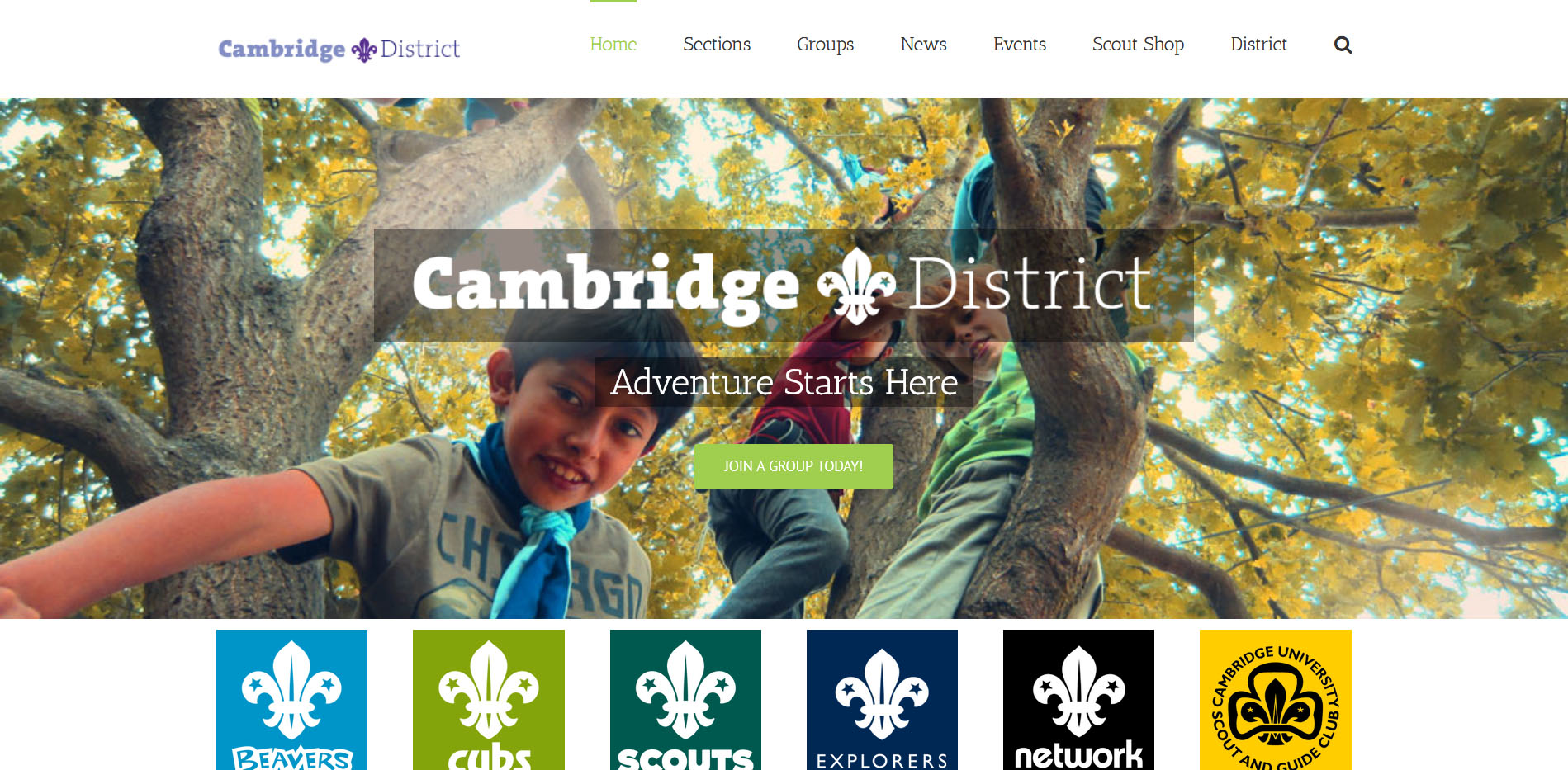
Before and after • Click and Drag to reveal each
Brief Overview
Back in 2017, we were asked to relaunch the Cambridge Scout District’s complete digital vision. Their website had not been updated since 2013, and was generally outdated and unusable.
From humble beginnings, the concept grew to a complete multimedia relaunch, with new logos, new media captured and branding included.
This page gives an overview of the mammoth task that was taken on over several years.
Logo Design
It became quite apparent rather quickly that the District needed a new logo for their online presence.
There was two main reasons for this:
- Most online spaces use a square shape for profiles (ie Twitter, Facebook etc), so their design was misshaped for these platforms.
- The Scout Association had revamped their logos a few years earlier, and the District had not migrated.
We decided to go back to basics and use the traditional Fleur de Lis as the core of the logo design, as this has been a continual fixture of the movement for over 100 years, and wouldn’t be “outdated” with another revamp from scouting headquarters so quickly. We also liked the idea of using the traditional design as it would reflect and be in keeping with the heritage of the area and the district. In the end, we created two versions. One “wide” version, that could be changed depended on the media it was being used on – letterheads, business cards, online profiles etc.
Media Capture
There was very little photographic and video media within the District that could be used for self-promotion. Each group varied too – with some prolific at capturing events to be shared within their community (but could not be used outside this community), while others had little to none.
We managed to establish a small group of passionate volunteers from within the District’s community, who went out to capture photos and videos of all sorts of events. Digital Rhapsody trained them in scouting policy about safeguarding within media, and used their material throughout our new designs.
Website Design
The website was the biggest challenge within this project. All the data and material on the previous site was either outdated, or not fit for their current purposes, so everything had to start again from scratch. We also had a unique challenge that some groups had their own online presence, while others did not – so we wanted to ensure we weren’t stepping on volunteers toes.
After spending a lot of time with most groups, and listening to their needs and concerns, Digital Rhapsody designed a site that was not only modern but also managed to be a “catch all” for all groups. We took inspiration from the health service within the UK to explain our plan; so the NHS (or the District) would provide the basics of the information with certain functionality. However, if groups wished to have their own presence, then they could easily, as if they were going to a private hospital. This “compromise” gave the flexibility of choice within the volunteers, and allowing them to have ownership over what was best for their group’s development.
Site Design Highlights
Powerful & impactful header
With the new logo in crisp white, over an amazingly active photo taken at Gilwell Park. With clean lines and simple design, it automatically attracts the attention of the user.
Large Banners
It was important to constantly bring in the core values of scouting within the design. We designed these large banners to parallax (move as you scroll), to encourage users to move up and down the page to reveal the full image.
Upcoming Events
It was clear that the community needed a core events calendar, that could be referenced instantly. Once again, site is built to auto-update different relevant sections instantly on the events – depending on age group.

Scout Sections
It was very important about the update that anyone could quickly gain an education about how Scouts works. So we came up with this simple coloured columns, with the official ‘section’ logos. Each with ages, and who can attend, instantly accessible.
Latest News from around the site
The site is built to auto-update different relevant sections instantly – depending on age group. This was a clear place to put all the latest news from the community in one place.
Clean & Clear Footer Navigation
No matter where the user is on this huge site, it was important that they could clearly access any part without feeling lost. Early on, we decided that the footer would hold this key information – like a mini sitemap.
Powerful & impactful header
With the new logo in crisp white, over an amazingly active photo taken at Gilwell Park. With clean lines and simple design, it automatically attracts the attention of the user.
Scout Sections
It was very important about the update that anyone could quickly gain an education about how Scouts works. So we came up with this simple coloured columns, with the official ‘section’ logos. Each with ages, and who can attend, instantly accessible.
Large Banners
It was important to constantly bring in the core values of scouting within the design. We designed these large banners to parallax (move as you scroll), to encourage users to move up and down the page to reveal the full image.
Latest News from around the site
The site is built to auto-update different relevant sections instantly – depending on age group. This was a clear place to put all the latest news from the community in one place.
Upcoming Events
It was clear that the community needed a core events calendar, that could be referenced instantly. Once again, site is built to auto-update different relevant sections instantly on the events – depending on age group.
Clean & Clear Footer Navigation
No matter where the user is on this huge site, it was important that they could clearly access any part without feeling lost. Early on, we decided that the footer would hold this key information – like a mini sitemap.
- Powerful & impactful header
With the new logo in crisp white, over an amazingly active photo taken at Gilwell Park. With clean lines and simple design, it automatically attracts the attention of the user. - Scout Sections
It was very important about the update that anyone could quickly gain an education about how Scouts works. So we came up with this simple coloured columns, with the official ‘section’ logos. Each with ages, and who can attend, instantly accessible. - Large Banners
It was important to constantly bring in the core values of scouting within the design. We designed these large banners to parallax (move as you scroll), to encourage users to move up and down the page to reveal the full image.
- Latest News from around the site
The site is built to auto-update different relevant sections instantly – depending on age group. This was a clear place to put all the latest news from the community in one place. - Upcoming Events
It was clear that the community needed a core events calendar, that could be referenced instantly. Once again, site is built to auto-update different relevant sections instantly on the events – depending on age group. - Clean & Clear Footer Navigation
No matter where the user is on this huge site, it was important that they could clearly access any part without feeling lost. Early on, we decided that the footer would hold this key information – like a mini sitemap.